Contest closed now: winners announced here.
I apologize for an off-topic post tonight, but I really need some opinions by Wednesday night (8 pm CDT, April 15). I need them enough that I’m offering cash prizes in the form of real money, not the fake paper stuff. I’ve asked a third party to randomly select at least at least one non-anonymous, unique commenter to receive a silver dollar for participating in this survey (two or more if I get at least 100 unique commenters). A one-ounce silver eagle may also be awarded based on quality of input.
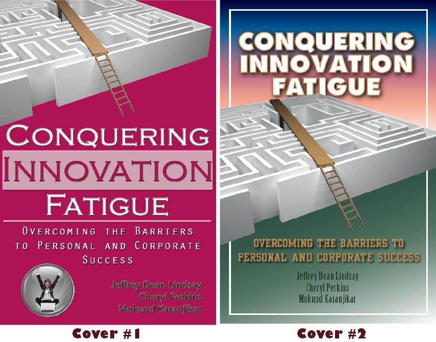
Here’s the scoop. We’ve got a book being published by John Wiley & Sons in couple of months. Several cover designs have been presented, but the ones I like best are from local talent. We’re trying to decide which of two differing approaches should be taken: the graphic (a maze) at the top (#1) or in the center (#2) of the cover. Two sample designs are shown below. Changes will be made in color and fonts, so don’t let that influence you (but comments are welcome). I’m mostly looking for input on the placement of elements. Given that, please let me know which of the two designs you like best and why (single sentence may be OK). To de-emphasize color, I’ve also included a black and white version of both.
I’m posting this on another blog or two as well. The comment that I find most helpful between these sources (I suspect it will be here) will receive a bonus of a beautiful American Silver Eagle one ounce coin. I know, I know, you think I’m just posting this to draw attention to silver as one of the smartest investments for people concerned about our hyperinflated future – but I really do need input from multiple eyes.
Please let me know what you think – and be sure to login. If you don’t want to register, make the comment with an assumed moniker and send it to me by email as well to identify yourself. Send it to jeff at jefflindsay.com.
Click to enlarge either set of images:
So which approach do you like best and why? Or let me know if they both fail and especially let me know if you have a better idea.
The book, by the way, is a book aimed at inventors, scientists, managers, business leaders, and even policy makers. It deals with the personal side of innovation, exploring the many fatigue factors that can shut down innovation, along with guidance on how to overcome or eliminate them. The maze image is intended to show that there are ways to bypass some of the barriers and frustrations on the journey to innovation success.


You have to go with cover 1. Have to. Cover 2 looks exactly like a Mormonad with the border, the kind of 80s-ish fading of color, etc. I don’t think that’s the look you’re going for.
I enjoy the centrality of the maze in # 2 because it catches my focus immediately. It works better spatially because the two images in #1 detract focus since it mixes your message.
Definitely the centered maze in Cover 2. It let’s you know where the plank goes rather than in Cover 1 where the plank could very well drop you in the middle of the maze. Though, I do prefer the typeface in Cover 1.
I think #2 is best. Having your title at the top gives quick info to browsers on what the book is about (the maze at top does not tell us what the book is about). Maze in center then naturally draws the eye down to the subtitle and authors. I suppose you could take the border off (however only a young mormon may catch the similarity pointed out). Get rid of the pink – stick with the contrasting colors. – just my “silver dollars” worth. 🙂
I agree with Michemily. Number 2 looks just like a Mormonad. I like Cover #1, but I would put the words “personal” and “corporate” success in a different colored font than the rest of the sub-title to make it stand out a little more. Good luck!
I vote for #2, with slight modifications.
1. I would crop the maze photo around the surrounding white border, rather than letting the photo bleed around the edges.
2. I would shrink the maze photo so as not to overlap the title of the book itself. Magazines can usually get away with this because the readers know exactly what the magazine’s title is, but obscuring any portion of a book title is probably not a good idea, since your potential readers have no previous experience with the book, and thus need to clearly and openly see the entire book title.
3. (Sorry, wading into typography…) I would not capitalize the subtitle of the book. If you’re choosing all caps for your main title, you want something more subtle and less invasive for the explanatory subtitle, and so it’s probably best to leave it normal.
4. I would carry over the style of the title from #1 to #2, namely the visual separation of the word “INNOVATION” to add emphasis and draw the reader’s eye immediately there. Doing so quickly helps the reader categorize your book.
Cover 1. My eyes jumped straight to the title, then wandered up to check out the maze, leading naturally to the ladder and the path over the top. And the other one does look like a mormonad.
Cover #1. The title jumped right out and I like the coloring. It looks good where as I agree with everyone else on #2, mormonad.
I like Number One. In my opinion, the font in Number Two is rather cheesy. However, the center placement in Number Two is more appealing, graphics-wise.
Provided that I win the prize, contact: jumpyfoot(at) fastmail.fm
i go for on top in color. #1 i guess. It looks like a book and not a New Era hangup.
I personally like Cover #1 because of the color, but my 18-year-old daughter says she likes Cover #2 because it looks like a Mormonad.
LaurieBee
I like the first one, but maybe something other than pink for the background. The second one screams MormonAd.
I like the one with the maze on the top. Just looking at it, I feel the ladder’s leaping off the page. This makes for an inspiring visual. The second one has the maze and ladder well-contained, and they lose some of their power.
Thanks for the opportunity to provide input.
Lisa (Swango) Carrillo
I would recommend #1. The title is the clear focus, with the emphasis on “innovation.” The maze didn’t make sense to me until after you explained it, so to me it doesn’t make sense to have the maze be the main focus of your cover. At first glance, the maze to me suggested a general representation of the rat race. I would try to fit more of the maze graphic in so that the top of the slide is visible, and maybe add some sort of destination or floor where the slide ends. On the second cover, the title is even hidden a bit behind the graphic. If I were scanning several books at the book store, the word “innovation” would stick out to me on the first and the maze would stick out to me on the second. And please don’t use pink.
I prefer #2 for its showing the destination of the ladder & plank; otherwise, it looks like you're unsure of where you might end up.
FWIW, even though color's supposed to be irrelevant, I would avoid pink for a book written by a man (call me sexist), and I really do like the color fade on #2 – it reminds me of a sunrise, as if graphically demonstrating that you're overcoming the fatigue.
On the fatigue note, a maze that doesn't have a visible end (#1) doesn't convey the most promising "solution image" – another reason I like #2.
Just my $.02! Thanks for the opportunity to preview & comment! 🙂
Jeff – go with #1, but change the color. I dunno, the pink / fuscia just doesn’t work for me, esp. given the topic. I personally like blues / dark greens…
I do much prefer number 1, although at the risk of being repetitive, I agree that pink isn’t the best choice of background color. In the 1st cover, the title does stick out immediately, and the image plays a secondary role, which is what I think should be the case. I do particularly like the highlighting of the word INNOVATION, which is the key word. I respectfully disagree with what people have said about not knowing where the plank ends. I think it is clear that this is bypassing the maze and offering a much easier path. I am not a fan of the gradient in the 2nd cover because the grass and the sky imagery seems to suggest that there is a literal maze somewhere, rather than the metaphorical maze you discuss in your book. And I don’t like the white border so much either. Last comment: the authors’ names are fairly hard to read in the first image, although I am sure that would not be hard to change. Nice job, whichever cover gets chosen will be great, although I do prefer the 1st.
Cover #1 but not pink
cover #2 looks alot better then one even in black and white
1 looks to busy and the graphic is incomplete. 2 is much more balanced and moves the eye around better.
This comment has been removed by the author.
Cover 2 looks less fatiguing to me than the bright-pink version.
With that said, the maze fits the subtitle but hardly seems to fit the title of the book at all. If I were going to re-do the illustration (I'm an illustrator), I would try something like:
1. Close foreground (exaggerated perspective) showing worn-out person working through the maze. = Fatigue.
2. Further out, the contraption is being used by another, happier person, to get to where they want to go. From our perspective, they are higher up/above the person who is fatigued.
I would also use two ladders (one to climb, one to walk on), as a plank & ladder substitute. The plank & ladder combination is not frequently used in the gazillions of maze illustrations out there, and while that may seem good for originality, it's not intuitive at a glance and may estrange readers as they try to grasp the cover in one go.
Our minds need a simple pathway if we're going to make a positive buying decision in a few seconds.
Good luck with your book!
Wow, great comments so far!
Some color has been lost in translation – the one people are calling pink is really more of a red in the original PDF. Puzzled over the pinkishness that displays here.
The biggest problem is that your sub-title carries the meaning of the book. You might want to reverse the sub-title and the title.
Otherwise, most of the book covers either focus on innovation (which really is not what the book is about) or leave the entire concept balanced.
You might want to browse the book _Making Ideas Stick_
I would go with the centered maze, it catches my view and gives a complete visual support to the book title. I believe the placement of the title at the top will get it read more, though the number 1 font size and emphasis also draws the eye.
My vote probably won’t count, but I just have to say that unless you are marketing your book to Mormons, the comments about the Mormonad are a moot point. Besides, Mormonads work because they are good design. #2 has much more spatial cohesiveness and is more pleasing to the eye.
Cover #2 is best because it shows the path stretched fully across the fatigue rather than just confronting it with a ladder. Cover #2 also shows the complete picture putting everything into perspective, both the solution and the problem.
I don’t like the plank. I actually had to look a few times to understand what everything was. The problem is that the shadowed part of the maze is unique, and so I assumed it was a vertical support under the plank, and that the plank was angled upwards. This could likely be fixed by lightening the shadowed part to make it clear that it’s part of the maze. I also don’t like the ladder/plank combination. Perhaps two planks, with one being a ramp, would simplify the picture?
I prefer cover #1. The offset icon look is very stylish, and I don’t think the icon needs to be central. It is, after all, just an icon. The book (hopefully) is about what’s behind the icon.
Finally, I don’t understand the picture in the lower left corner of cover #1.
I prefer design #2. To me, seeing the other end of the maze seems to show that there is an eventual end to it. When I first glanced at the cover I noticed the maze. I then saw the title which made the maze make sense.
Jeff, if you have to go with these two, #2 is the better composition and presentation of the two. They both scream, “I’m self published!” but I suspect you want that.
The typography is #2 is better crafted than the the choices in #1; #1 has a bit of a “Department of Homeland Security” statistical report. In either case, a recommendation for both would be to minimize the number of typefaces you’re using. On a cover with as few text areas as you have here, two typefaces will more than suffice. More than that adds to the visual noise that’s already going on in both of them.
I’m assuming the maze and plank are explained in the text, so they’re probably not up for discussion. Composition #2 might be better served by toning down the multicolored gradient and thinning the white surrounding border a bit.
The “it looks like a Mormonad” comments are unfair, but it’s worth noting that those comments probably come from the unfortunate (and familiar) pairing of both the typeface (Futura, which the Church uses heavily) and gradient backgrounds which had saturation in the late 80s/early 90s.
@Connor: I’d wholeheartedly disagree with cropping the maze inside the white surrounding keyline; that the maze runs outside the border and off the page gives the composition some visual tension that it needs.
@ngthagg: Agreed on the image in the lower left corner. It’s irrelevant to the design and detracts from the main message.
Good luck, Jeff. And, go Bruins.
A quick impulse response upon seeing them was that it wasn’t even close, Cover 1 is much better. I’m having trouble pinpointing why I felt that way. Cover 1 is more up-close, puts you right there with it. Cover 2 is more far-offish, away from you. Cover 1 has greater impact because it draws you in, makes you feel more like you are there as part of it. — John Jackson
P.S. Instead of the silver, could I get Jazz playoff tickets?
Cover 2 is by far superior: the maze shape is clearer and the colors are comforting and professional (versus the sinister coloring of cover 1 with its weird floating maze).
I like Cover 1 — sans the copperplate gothic typeface / font (no good… yeah I’m a design snob).
I do like the way the maze is cropped and taking up roughly 1/3 of the cover. I’d make the title text smaller as well so it’s not filling up all the space– rather, leave some negative space on the cover so it’s not so crowded.
I like #1 and think it would be great in red. The blues and greens are nice and restful to the eye–which is counter to the point of the book. I think ladder and ladder over the maze would be too visually distracting. I’d rather walk on a plank.
Do change the font and color of the authors’ names. I think you should be able to find them on the cover.
I would either remove the person in the bubble or change the graphic to illustrate breaking out of the bubble.
The format and color of #2 make me think of pamplets that are given to people because they’d be “good for them”. #1 looks as though it would be an interesting and fun read.
I look forward to reading it.
–Norma P
mawcawn@hotmail.com
I would definitely say that option 2 is superior. It looks much more professional. The layout has a much more natural flow and emphasis. I find the mormonad business to be a silly premise for dismissing an otherwise bold design.
Considering the implied demographic, the comparison seems entirely irrelevant.
However, if it is a concern, I wouldnt mind seeing an alternative version of the second design, sans border. a couple of alternate fonts might also be helpful.
Comments on cover 1, I prefer the title, especially the emphasis on the word innovation. I don’t immediately get the plank goes to the other side of the maze however due to the placement of the graphic.
Comments on cover 2, I prefer the central graphic here as the image of the plank going across the maze is clearly told. The main title isn’t as appealing however.
My preference is to take the stronger title from cover 1 and couple it with the image from cover 2.
Other thoughts are to show a couple of people trapped in the maze with someone who “gets it” clearly taking the short cut.
No 1. Mainly because you cannot see where the path ends in #1. Creates an open question…”where does this end?”
Also like color scheme better.
GOOD LUCK!
The choice for me is easy (so it will be interesting to go back and read the other comments after I post my own.) The one on the right is far better. It’s all about where your eye falls, which for me in both images is directly in the center of the page. With the image on the right, my eye sees the graphic and naturally flows immediately up to the title. With the one of the left it immediately hits the title and the graphic above serves only as a huge distraction.
Just my two cents.
I'm a graphic designer, so I'm probably overly critical of the design.
I love the idea of the maze with the bridge. It is a great symbol of the meaning of your book. That being said, I'm not enamored with that particular graphic. I'd have to play around with the elements a little, but perhaps it would be more attention-grabbing if it were zoomed in to focus more on the bridge, and less on the maze.
I like the balance and depth of the center placement, giving the cover a back- and foreground. Have you tried placing it more towards the bottom? Generally speaking, designs are more aesthetic if they divide the area into thirds rather than halves. Giving the title more room, with the subtitle joining it at the top, and leaving the names at the bottom would emphasize the most important aspect of the book to the casual browser.
The border and the gradients actually detract from the titles and the image in the second design. Real estate on a book cover is expensive, I'd utilize it carefully.
The same advice goes for color: use it carefully. Go to a bookstore like Borders or Barnes & Noble to see what colors other books similar to yours are using. If other books use bright colors, simplify your color palette. If other books are largely white and business-like, go for tastefully chosen bright color. Try to align your design with the other books, but give it something a little more to draw attention.
Most importantly, I would spend a great deal more time on the typography. Pictures are what most people see, but typography is at least as important, strongly affecting the viewer’s opinions subconsciously. I’m really not fond of any of the fonts used, and the placement of the text is a little sloppy. I’d decide what message you want the font to send (strength, decisiveness, innovation, etc.), and speak with a seasoned typographical designer, font book in hand, to decide what fonts would best communicate that message. From there, a designer could begin to better manipulate the text to balance the graphic and the message you’re wanting to send.
Oddly, book cover design is one of the most important aspects of selling a book. Take your time with it, if you can.
I don’t need the silver dollar (the opportunity to critique is enough for me), but feel free to email me at rainscamedown at gmail if you have any other questions or ways I can help.
First I would like to say that as a retired newspaper graphics person, I have learned a lot about design just by reading the comments on this post. Very interesting!
Now, about the #1 design. The graphic simply does not work because the edge of the maze shows. So, why climb the ladder and cross the plank? You could simply walk around! The other objections also apply: weak typeface, irritating little bubble graphic, awful color.
#2 is better, but why have the white border at all? And there is the impression that the plank and the ladder are COMING at you (since they come from left to right. What if you flipped the graphic so the ladder and plank are GOING, i.e., are the solution to the problem of how to avoid the maze.
I strongly agree that only two typefaces should be used, unless there is a compelling reason for a third, such as a typeface that has meaning in and of itself, such as some kind of bold, militant face for the word “conquering” that would set it apart from the two-word phrase “innovation fatigue,” which is what is being conquered.
Lastly, it would be cleaner looking to have a solid background with, if anything, a cast shadow from the maze providing some variation and dimensionality.
I like cover 2. It seems cleaner, less cluttered, easier to instantly read and grasp. I realize colors may change, but I also like #2s colors better. I get the comments about Mormonads, but don’t care. Those that would be familiar with that are a small subset of the target audience.
Cover #1 seems more confident. Cover #2 seems like the designer wasn’t quite sure what to do (“I guess we’ll center all the text”) and threw in some color to hide it.
I prefer #2 Simply because of the colors used. The others look awfully boring!
Jeff,
(Smart move. Getting free market research from your blog followers! Hiring a research company to survey opinions would have cost hundreds or thousands of dollars.)
I don’t think the subtitle does well in explaining what you mean by “innovation”, or who/what your target audience is.
“Overcoming the barriers to personal and corporate success” just sounds too much like a worn-out catch-phrase, as used by the myriad of other sales training and business coaches out there.
“Innovation fatigue” is a phrase that makes you stand out, that differentiates. But your subtitle doesn’t flesh it out like a good subtitle should.
How about “Maintaining the pace of invention and re-invention.”
Ooops, I should have copyrighted that. Jeff, as you are an honorable man, I’m sure you’ll pay me a fair royalty if you use my line as the sub-title of your book! 🙂
I think Michemily has a point too, in comment #1. Cover #2 has better colors, but the design is very 80s/90s-ish.
Hey, there’s a client for you! Your graphic designer needs to conquer innovation fatigue and innovate a new graphical look and feel.
Also, the symbolism of the maze and the ladder don’t quite speak to me. Or else I’m misinterpreting what innovation fatigue is.
I’m a magazine editor/designer and former Wisconsin resident (which should get me extra bonus points) and it’s cover 1, not even a close call. “Meh” to the background color however.
Cover 1 has significantly more contemporary fonts and flow, and it looks like it was designed within the last 10 years. ’nuff said.
I was about to vote for cover 2, but then I read Michemily’s post and had to laugh that she was right about it looking like a Mormon Ad from the 70s.
I do like cover 1’s text elements and modern look, though it does look like something designed to gain more dust on a University bookshelf than something professionals out in the workforce and on transit would go for.
The thing I liked about cover 2 was that the plank from the maze seemed to be leading up to the title and it the maze just looks well placed to be in the middle catching the eye and linking the title and subtitles together in an interesting way.
So my vote is for #2 with some modernizing of the typeface and background colours.
cover 2 jumps off the bookshelf into my hands,which is what you want as the goal. I don’t understand the fuss about it looking too much like a mormonad. Your target audience isn’t just from Utah.
Looks like I’m late, but I like number 1. The person in the bubble at the bottom really caught my eye!
What a great group of readers! Really appreciate the feedback. Helped change my mind on some issues and clarify our approach. Stay tuned.
Congrats to the winners of silver. Its value won’t drop to zero if a CEO was a crook, or if the Fed keeps printing trillion of dollars backed by nothing but hope.
Rats, I missed out.
For what it’s worth my eyes went straight to #1 in both color and black and white. I tried not to focus on reading it at first, just which design got my eye. Definitely #1. Once they’re attracted, then they’ll read the cover.
Anway, I’m late to the game soooooo…
Supposedly you can’t judge a book by it’s cover so does it matter? If I could reuse a Clintonism (and I never thought I’d want to) – It’s the content, stupid!
The scriptures have the plainest covers around but to me the best content.
Jeff, all the best with the book.
Yes, we’re going with a version of #1. Thanks!